This week, I would had my first Crit Session with my animation supervisor Dan. Since there was no Zoom session, he told us in a PowerPoint how we should give and respond to feedback that would be crucial to our final project.
Projects
Media Project – Week 2
This week, I am comparing 3 examples of bad branding and good branding respectively.
Bad Branding
- Current Roblox logo

Roblox logo (2017-present) This is the worst because it lacks the creativity and imagination of the previous logo, which looked like this:

- Current DeviantArt logo
DeviantArt (formerly deviantART) logo (2014-present) This is the second worst because it is a bit bland compared to the more imaginative (therefore fitting in the style of the website) previous ‘da’ symbol introduced in 2001, which looked like this:

- Current Pringles US-only logo
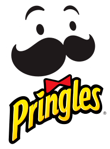
Pringles US logo (2020-present) I think that this US-exclusive (for the time being) logo for the internationally-recognised crisp brand is the third worst branding on this list because it unnecessarily did away with the mascot Mr. Pringles’ hair and the outline of his circular head, making it look like his face is floating on a page with a white background like this.
Good Branding
- Classic Nickelodeon ‘Splat’ logo
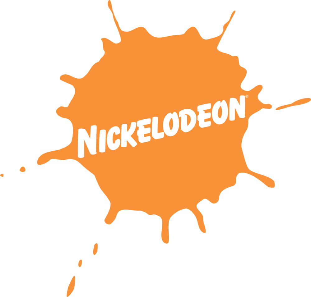
One of the most creative brandings in the world, the emblem was first heralded in the early 1980s to represent the American children’s channel now internationally known for its animation, game shows and sitcoms after a slow start and has since been beloved by its fans for its ability to change forms.
- Amazon logo

Introduced in the year 2000, the logo has good branding because it has an arrow that goes to the letter A to the letter Z, signifying that the Amazon website has a huge collection of things from A-Z.
- Tour de France logo
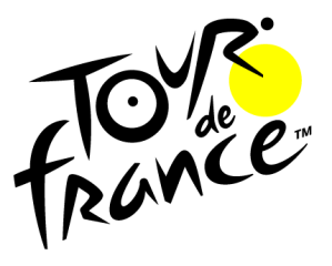
Current version of Tour de France logo (2018-present); From 2003-2018, the yellow circle was originally orange. This is in third place because the logo for the yearly sporting event subtly includes a man riding a bicycle, which I did not notice until I was doing research since I assumed that the dots were solely there for cosmetic purposes. Kudos to Joël Guenoun, the French graphic designer who helped to design it!
Pre-production
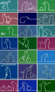
I will make an animation inspired by the classic Italian cartoon named La Linea and utilise the unique art style of the aforementioned show.
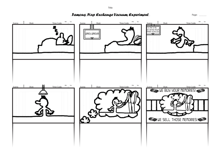
I have designed a storyboard for the animation, which is supposed to be an advert for my client’s business.
Media Project – Week 1
My client is the Famous Nap Exchange (or F.N.E. for short). For them, I am planning on making a short 30-second animation.
- Animation
For the short animation, I will be getting most of my inspiration from the classic 1970s Italian animated series La Linea (Italian for “The Line“), which was popular in its home country and various countries around the world, because it has an interesting art style that allows for a great visual experience and a muted palette, and the antics of the emblematic British stop-motion character Morph created by Aardman in Bristol.
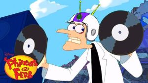
Also, since the client is a company that specialises in the questionable act of literally trading memories and feels the need to include that they are going to do nothing suspicious with them, I am going to add a mind control element to the animation as influenced by certain episodes of cartoons (e.g. Phineas and Ferb or Kid vs. Kat) where a character (or multiple characters) end up being mind controlled in various ways such as wearing a helmet. The mind control element would allow the sleeper’s famed memories to appear on the client’s screens so that they would know exactly what they are exchanging.

- Illustrations
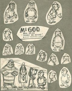
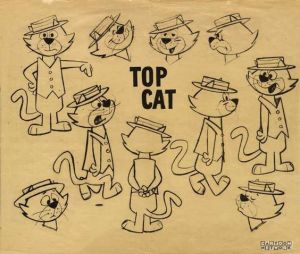
For illustration, while the designs were made for limited animation, I would use UPA (United Pictures of America) and Hanna-Barbera cartoon model sheets because they have great thick line art.

- Branding
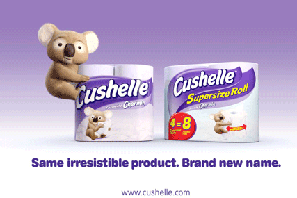
For branding, I would choose something that the client look more… heartwarming and give a sense of innocence similar to that of brands like Cushelle, which was previously called Charmin prior to 2010.
Creative Synergies In Media Production – Week 7


Creative Synergies In Media Production – Week 6
Creative Synergies In Media Production – Week 5

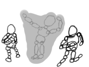
In Week 5, I had a fourth week of observational drawing sessions.
Creative Synergies in Media Production – Week 4

Creative Synergies in Media Production – Week 3
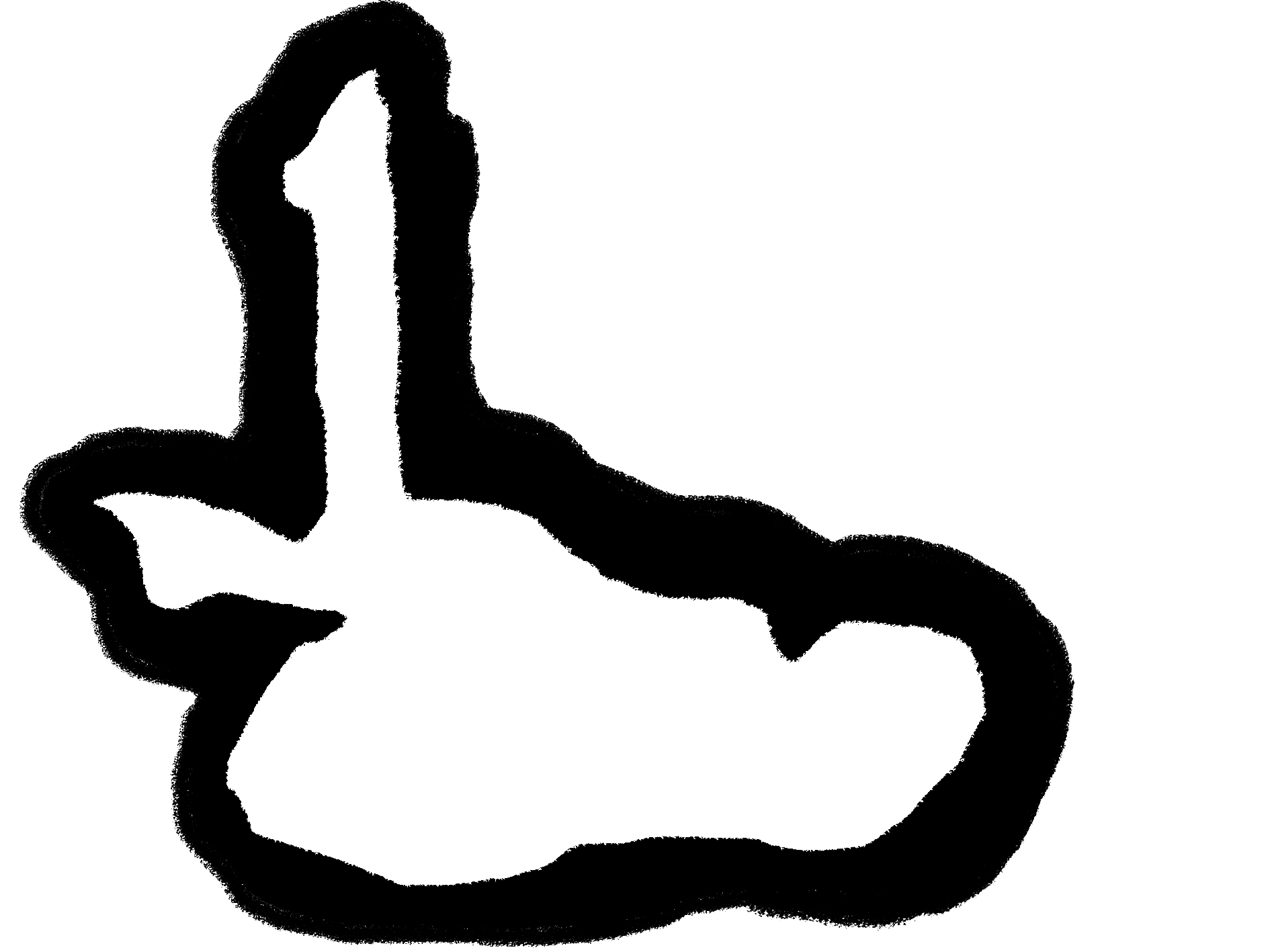
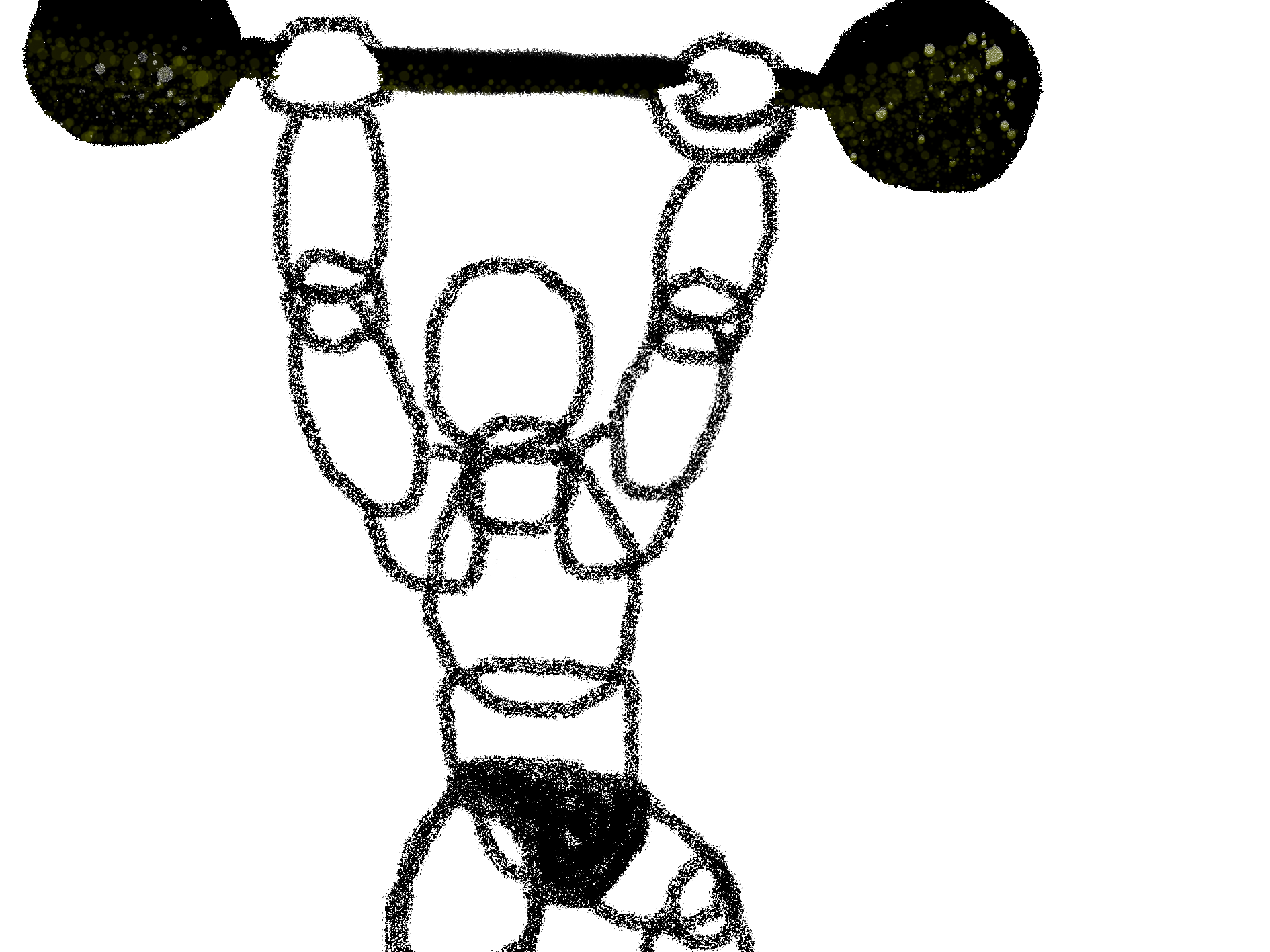
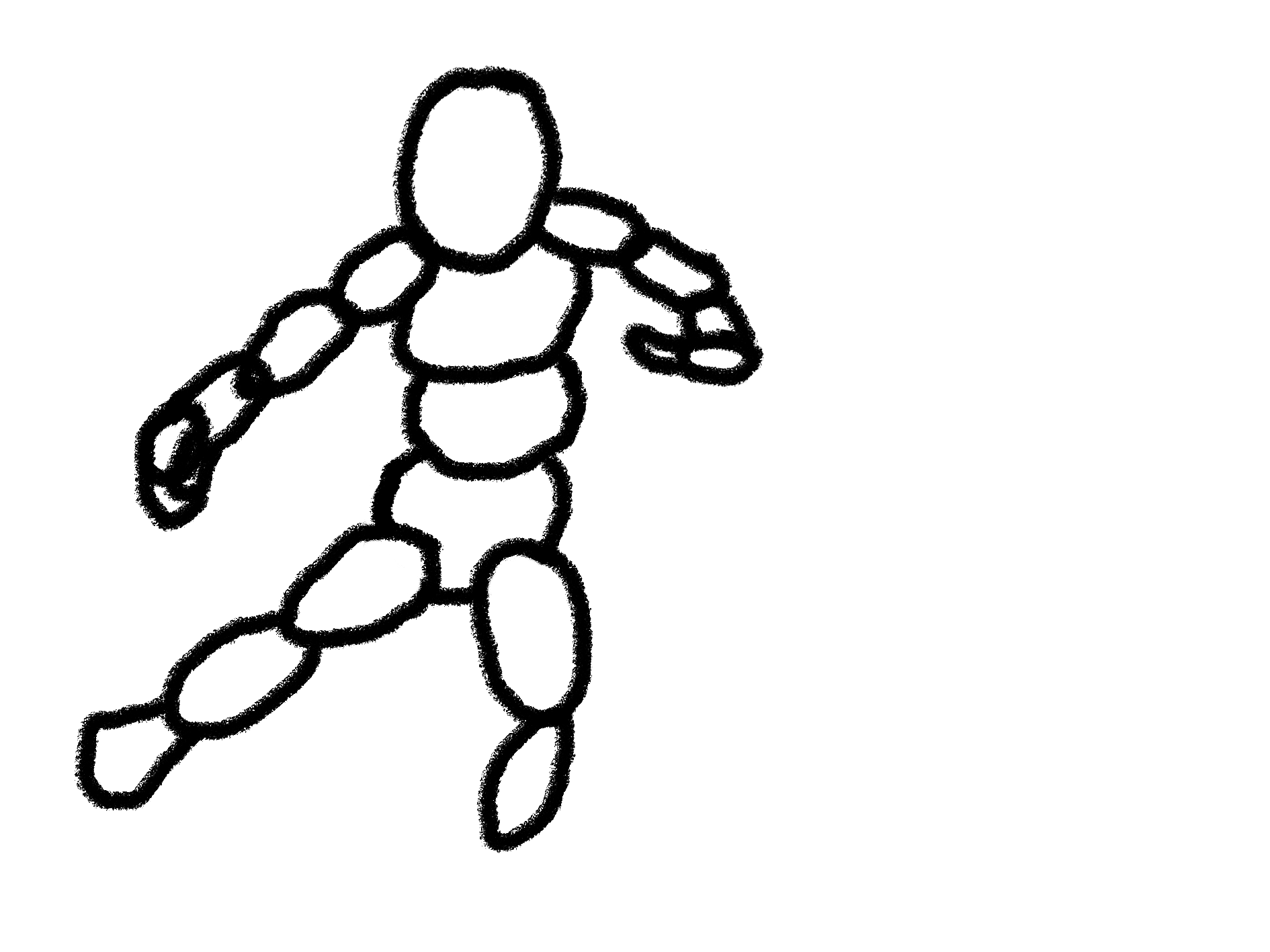
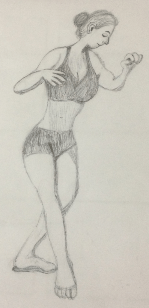
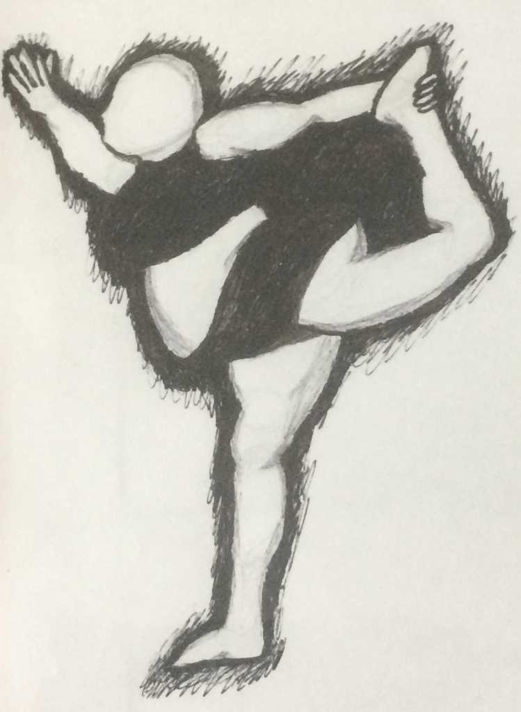
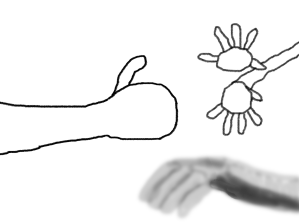
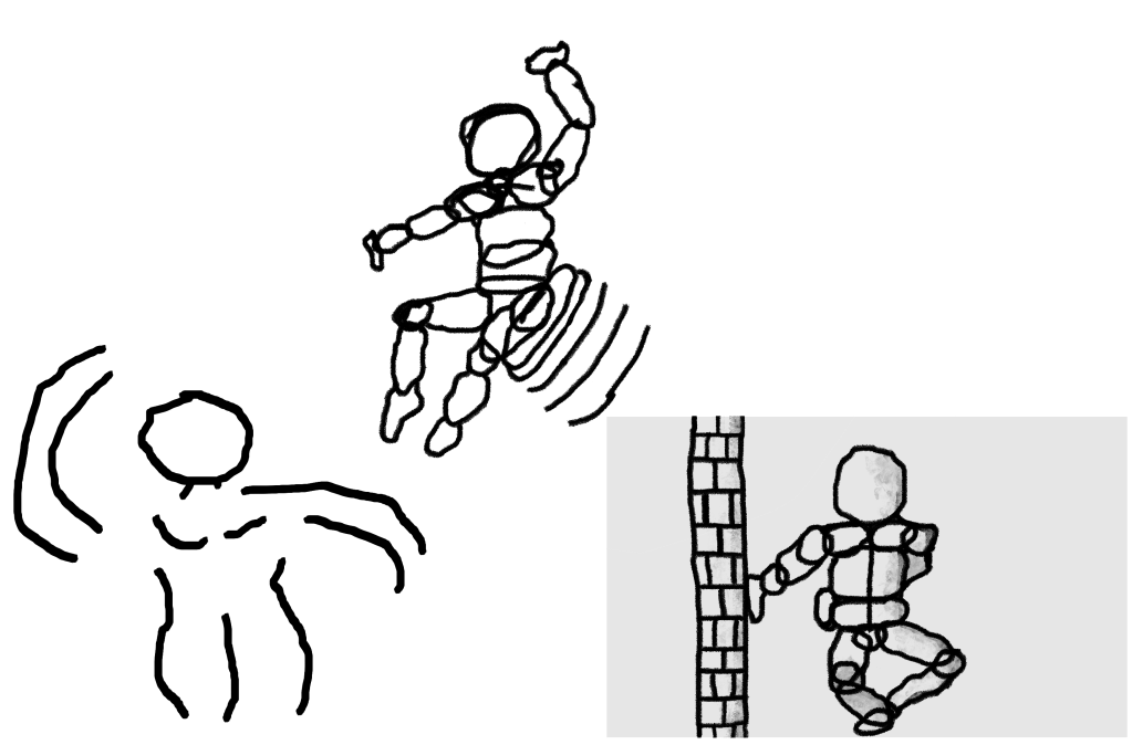
In this module’s tertiary week, I had another observational drawing session with my Animation colleagues. This time, I had to do a challenge to drawing a picture of a hand and some life drawings of human bodies.
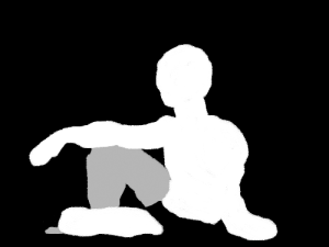
At first, I did three full body life drawings focusing on different poses.
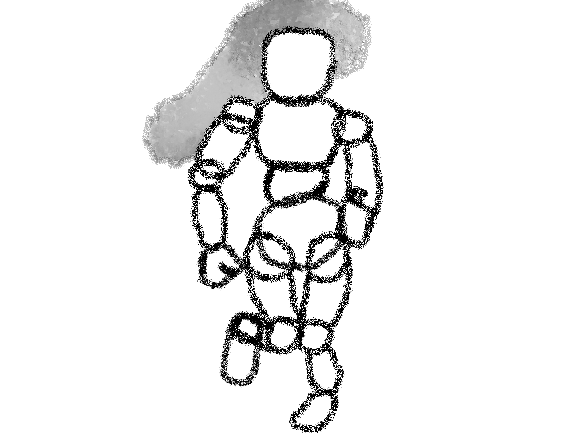
Later on, I drew a hand and later a man with pans.

Creative Synergies in Media Production – Week 2
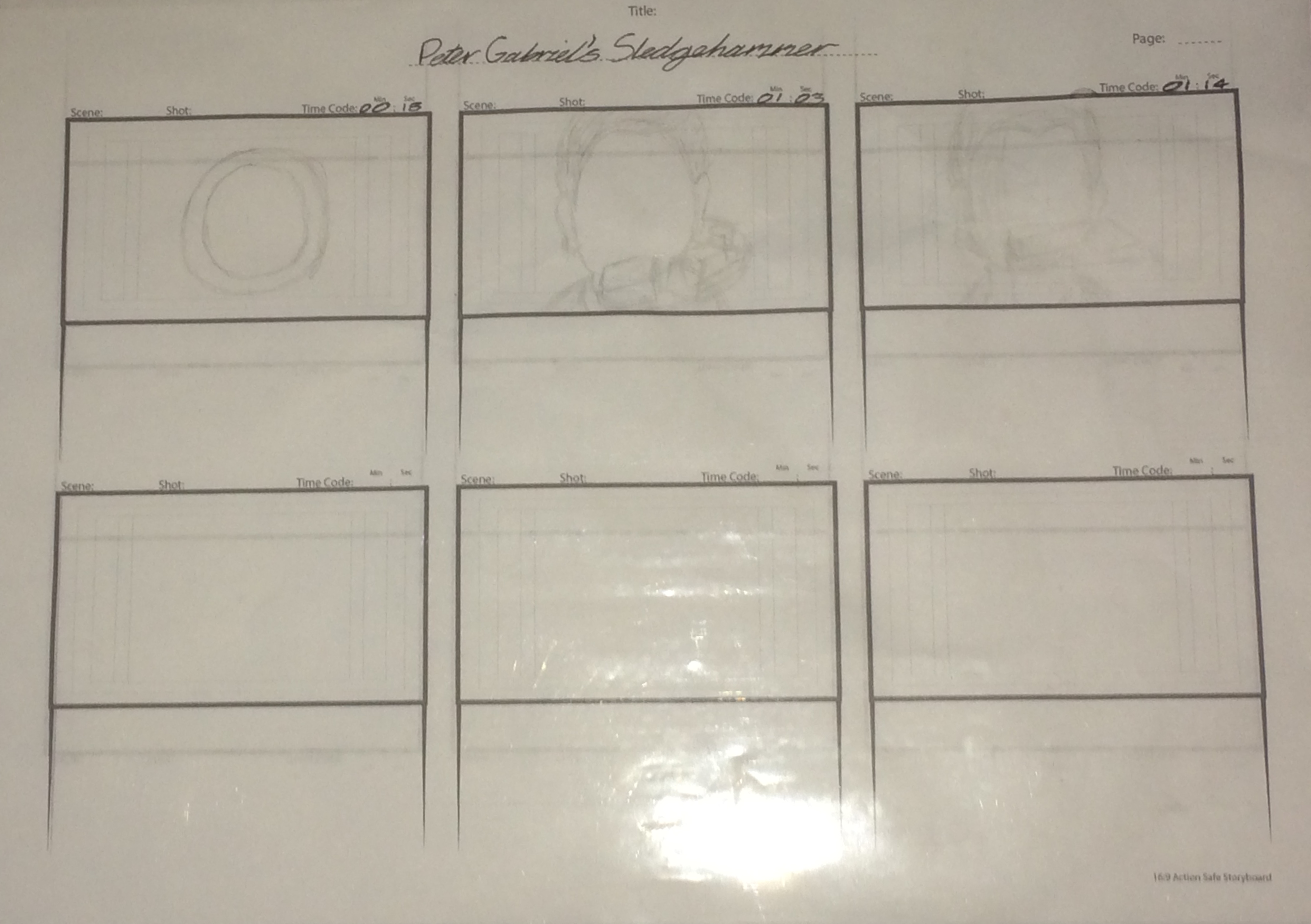
In Week 2 of the Creative Synergies module, I did a partially-completed storyboard based on the emblematic 1985 music video Sledgehammer by Peter Gabriel that was animated by Aardman Animations and, the day before, made some observational life drawings influenced by the poses of human models (in picture form, dismally, due to the current situation around the world).
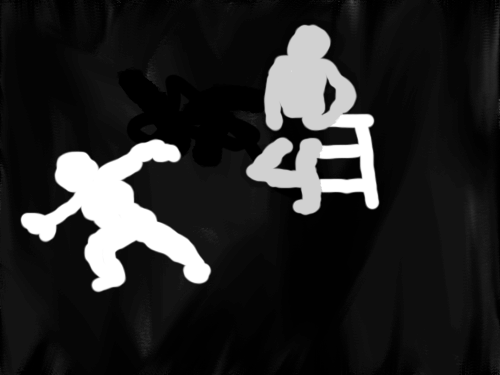
Sledgehammer retroboard
Here is my incomplete storyboard of the hit music video of Sledgehammer: