This week, I am comparing 3 examples of bad branding and good branding respectively.
Bad Branding
- Current Roblox logo

Roblox logo (2017-present) This is the worst because it lacks the creativity and imagination of the previous logo, which looked like this:

- Current DeviantArt logo
DeviantArt (formerly deviantART) logo (2014-present) This is the second worst because it is a bit bland compared to the more imaginative (therefore fitting in the style of the website) previous ‘da’ symbol introduced in 2001, which looked like this:

- Current Pringles US-only logo
Pringles US logo (2020-present) I think that this US-exclusive (for the time being) logo for the internationally-recognised crisp brand is the third worst branding on this list because it unnecessarily did away with the mascot Mr. Pringles’ hair and the outline of his circular head, making it look like his face is floating on a page with a white background like this.
Good Branding
- Classic Nickelodeon ‘Splat’ logo
One of the most creative brandings in the world, the emblem was first heralded in the early 1980s to represent the American children’s channel now internationally known for its animation, game shows and sitcoms after a slow start and has since been beloved by its fans for its ability to change forms.
- Amazon logo

Introduced in the year 2000, the logo has good branding because it has an arrow that goes to the letter A to the letter Z, signifying that the Amazon website has a huge collection of things from A-Z.
- Tour de France logo
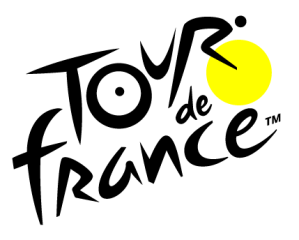
Current version of Tour de France logo (2018-present); From 2003-2018, the yellow circle was originally orange. This is in third place because the logo for the yearly sporting event subtly includes a man riding a bicycle, which I did not notice until I was doing research since I assumed that the dots were solely there for cosmetic purposes. Kudos to Joël Guenoun, the French graphic designer who helped to design it!
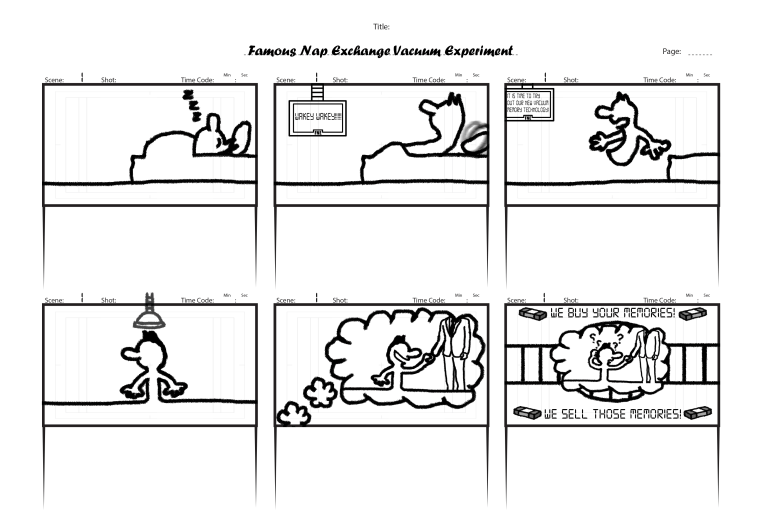
Pre-production
I will make an animation inspired by the classic Italian cartoon named La Linea and utilise the unique art style of the aforementioned show.
I have designed a storyboard for the animation, which is supposed to be an advert for my client’s business.